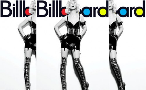
Pop star Christina Aguilera sports a daring pair of Louboutins on the cover of the latest issue if Billboard Magazine. She looks great; proof, no doubt, that stripping down to her birthday suit isn’t always nescessary. Just saying…
Christina Aguilera Covers Billboard Magazine
Christina Aguilera fans (affectionately called #Fighters) who haven’t been able to fight their way to a movie theater to see the Pop diva’s ‘Christmas in Paris‘ concert film are in luck as she’s teamed with CBS to bring the critically acclaimed venture to homes… Read More
As the critical acclaim continues to roll in for Christina Aguilera‘s ‘Christmas in Paris‘ concert film, the Pop diva is still giving fans who couldn’t make it to the theater tastes of the project’s incredible production.
Having already gifted the official video rollout… Read More

Home | About TGJ | The Splash | The Word | Advertise | Contact Us | Privacy Policy | Cookie Policy | DMCA
© 2026 ThatGrapeJuice.net. All Rights Reserved. A Member Of Townsquare Music


![New Video: Christina Aguilera - 'Ave Maria (featuring Yseult)' [Live from the Eiffel Tower]](https://thatgrapejuice.net/wp-content/uploads/2025/12/ave-maria-yseult-thatgrapejuice-2025-christina-aguilera-eiffel-tower-christmas-paris-464x260.jpg)


![Bad Bunny CHOKED by Fans in Argentina [Video]](https://thatgrapejuice.net/wp-content/uploads/2026/02/bad-bunny-choked-argentina-tgj-464x260.jpg)
floptina 🙂
i love Xtina but this image of her is really makin me sick i mean i am tired of that look!
This SHOULD have been the cover of her album. Much sexier than that weird cheap photoshoped mechanical looking painted face pic.
It would have been like a “Stripped” part 2 cover for 2010. Damn…that would have been a good idea.
Do you guys think an album cover can make a break an album, as much as the songs on it? I think it sets the tone…and with her current cover I am kind SMH at it….I am sick of seeing upclose face shots for cover of albums.
What are yor favorite album covers?
Bad covers…
Janet Jackason – 2.0 YO
Keri Hilson – In a perfect World
Ciara – Fantasy Ride
Britney Spears – Blackout
Madonna – Hard Candy
Have a great day everyone!
@Madonna
YESSSS HONEY! For example I thought Rated R was a bad cover in my personal opinion.
And sam sweetie I’ll be looking for a post similar to this one when 50 cent. Trey Songz, or any other male artists poses with their shirt off. Nobody likes a hypocrite.
Just saying..Love you xtina but please come out with another song and video because Not Myself Tonight was a major flop.
Oops…can’t forget Rihanna’s ‘Rated R’!
Sorry RiRi fans…but that is a perfect example of setting the tone of an album in the wrong way….
@Gucci
Even though NMT is a flop…I still can’t help but jam to it on my ipod.
Maybe the song would have been saved it she put out a video with one theme (not 50 themes rolled into one). Or did a major club scene with a HOT dance breakdown towards the end. Next time keep it simple.
I think it had way too many images to keep you focused on the song.
(same can be said for Janet’s ‘Feedback’…crap videos can ruin a HOT song)
OMG is that Madonna on the cover of billboard magazine, she never looked better.
@chocolate
No baby, that ain’t me.
She look soo… I’m starting to get tired of her already
She look hot bionic will be the s***
danmm sam your always haitting on Christina but when Beyonce wear nothing but bathing suits your dont say anything about that…..
I like Xtina’s look! I like this s*** image for her. I don’t mind the n*** cover shot(from the other magazine), although 1 time is enough right now to make a statement. I do think bad videos work against a hot song. It’s a combination (song + video) that works together and is meant for the song to have it’s overall impact. When 1 is off it does allow for the entire thing to fall apart. I think Xtina NMT should of had a dance number it was begging for a breakdown! Janet’s Feedback video should have not been in space, it would have been more effective if it was shot in Japan with a group of girls of different races parading around with Janet! Anyway, I love Xtina’s image and I’m sure the album will do just fine. Some artist you can expect better quality music from and she right now is one of them!
Hey people, what constitutes a flop? Ii a flop in the U.K different to a flop in the states?
She looks hot. I cannot wait for Bionic!
@Kev
agreed!
@madonna
I hate Rated R cover, it was just… too emo
SHES LOOKS GOOD
CHECK OUT MY NEW ENTERTAINMENT SITE
http://WWW.FRESHURBANENT.CO.UK