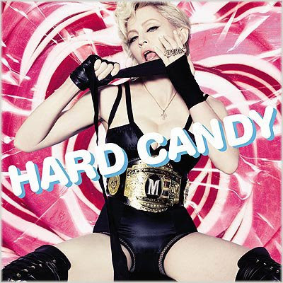
 Pop superstar Madonna is set to release her latest album ‘Hard Candy’ on April 29th, boasting contributions from the likes of Timbaland, Justin Timberlake and Pharrell Williams. The above pic has been revealed as the LP’s official cover. Though I’m kinda feeling the look she’s gone for, the background is a mess, as is the ‘Hard Candy’ font.
What do you think of the cover?







WTF. That is all.
I think its about time she closed those damn legs.
I quite like the cover, but cant say that much for her new material… She should just stick to pretending to be English and let the real entertainers (JANET) do they thing
Madge why do you insist on showing us your vadge? Close those damn legs have some respect girl.
I agree with you Sam the font and background make it look cheap, was this done by the same clown who did Britney’s album cover that was a HAM too…
I’m feeling her new single, I’m not a Madonna fan per say, I love her “Bedtime Stories” album and a select few tracks that she’s released like “Frozen” and “Beautiful Stranger” but I’ll admit when she’s got it and this time round she’s bringing the heat. I can’t wait to hear the other Timbo and Neptunes tracks!
Yeah I like the concept she’s going for, but yeah Madonna def. needs to close those 50-something year old legs and get a tan or something. The text makes this cover look like a 10 year old did it. The background isn’t THAT bad, but she could have done better. I liked her ‘Confessions on the Dance Floor’ cover, but this is average at best.
Wow. That album cover is fire.
I think its well hot – eye catching which is what she wants, the text fits in with the sweet candy concept. B**** knows how to take a kool photo anyway!
I like it, she looks good for her age.
Madonna Rips Off Kylie Again
http://www.judiciaryreport.com/madonna_ripping_off_kylie_again.htm
are you kidding me.
1. Madonna came first overall… therefore Kylie is ripping off Madonna
2. Kylie would be ripping off Madonna just fine if there were actual similarities… the closest thing to similar is the position of their fingers…
3. Madonna’s position makes more sense to be touching her lips since it’s called CANDY SHOP! and there are one million and one ways to connote the idea of “hearts” in a different pose.
I think that this cover is pretty awesome, the text is great and very lively and it even looks like a long lollipop transformed into letters, almost like neon lighting the back ground makes complete since unless you don’t know what hard candy looks like while it’s being made… get with it people!