(‘Woman To Woman’ standard album cover artwork)
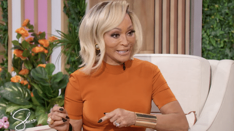
Whipping fans into an instant frenzy, “I Just Want It To Be Over” beauty Keyshia Cole is just beginning her long promotional journey for her upcoming LP ‘Woman To Woman’ (November 19th).
Led by singles ‘Enough of No Love’ and ‘Trust & Believe’, Cole is said to be hard at work shooting the video for the former while taking to Twitter moments ago to unleash the deluxe album artwork for the highly anticipated R&B set.
Originally believed to be the standard version’s cover, cop a gander at both (standard and deluxe covers) below and tell us:
Which do you like better?


http://www.youtube.com/watch?v=NmK19oyjWpY&list=UUNrc7bT8mI6Wu_VH2G5gmLw&index=1&feature=plcp
STOP WITH THE DAMN SPAM B****!!!
I like the original better.
I agree. Its very slick and sophisticated. Showing real classic beauty.
What is with this b**** and blue lipstick. It looked whack on the last album it looks whack now. SMH
True!
too much makup on the second one
Deluxe hands down. I just can’t with that standard one..
this should have been the standard version cover
the second one is better the first one looks like a cheap instagram picturew
i almost dont care
I like the original better. It’s much more “feminine” and sincere.
But Keyshia always delivers with album covers as well as the music. I’m so stoked for this album.
Brandy, Keyshia, Ciara… Jesus, Son of Mary, what have I done to deserve such blessings before the end of 2012?
Who cares
Obviously you do, or you wouldn’t have bothered entering the post.
Just like brandys new album the standard versions are better!
There’s too much make up and blue dosnt suit her!
Its all about the music though but then again I like looking at the album artwork when the songs are playing on my I phone.
im comfused! isnt the one without the blue make up the deluxe not the standard?
blue lipstick = standard version(see caption under photo)
@Quinno Rashad thank u!
H**
Hope this cover will help her to get a role in a major horror film!
Right now, Brandy’s album cover is a lot better. She looks amazing, like she hasnt aged a bit. Keyshia, no girl, that cover is b*******. Sry guys.
They both look sorta cheap, the label could have coughed up a lil more money than that
i like both. but she looks better on the deluxe. beautiful and more natural.
I actually like both covers! I love the blue lipstick although it drowns out my color when I try to wear it!! On Beyonce and Keyshia it really makes them shine. IMO
I’ll skip on the bonus tracks just because of that ghetto blue lipstick….
the lighter shade lipstick. Keyshia is very pretty and versatile, but she should leave that dark ass lipstick alone, at least on album covers, its not a good look IMO.